Inayaili de León Persson
on 16 April 2013
Yesterday we’ve launched an updated version of ubuntu.com, which we hope will improve navigation throughout the site and provide visitors with a better understanding of what Ubuntu is.
Research is an important part of what we do, and this update isn’t an exception. The improvements we have made in terms of content and structure of the site are mostly a reflection of what users have told us during testing, such as clarifying the description of what Ubuntu is when you are browsing the Desktop section.
Refocused navigation
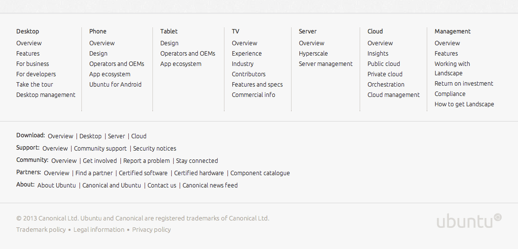
By focusing our site navigation on the products themselves, we aim to make it clear for someone who is new to the site that Ubuntu is about all of these things: PCs, phones, tablets — you name it.

New ubuntu.com’s product-based navigation
Updated footer
We have introduced a contextual footer at the bottom of most pages. This gives people an opportunity to explore more of the section they’re in and read related resources like news and articles. We have also made the main footer work harder by providing a bird’s eye view of the entire content of the site.
An overview of ubuntu.com in the updated footer
But the changes are not just about the site’s structure. Visually, ubuntu.com has been evolving ever since it was first launched, and with the latest update, we keep moving towards a cleaner, fresher, but also more modular, approach.
This direction started with the design of the phone and then the tablet sections of the site, which took existing design components and “opened” them up — we’ve added larger margins, lighter text, more space all around.
We then revisited the other sections of the site and standardised the templates and remaining components as much as we could. This exercise took a great deal of close collaboration between design and front-end development: it was important that design decisions were agreed by everyone and that the code reflected those decisions.
The product of this code cleanup had already been made live a few weeks ago, but the more visible side of the cleanup happened right now, with this update.
What we’ll do next
We will be working on, and improving, the way you navigate through ubuntu.com and other websites in the Ubuntu web universe in the coming months, so keep an eye on this blog! And, as always, we’d be delighted to hear your feedback.